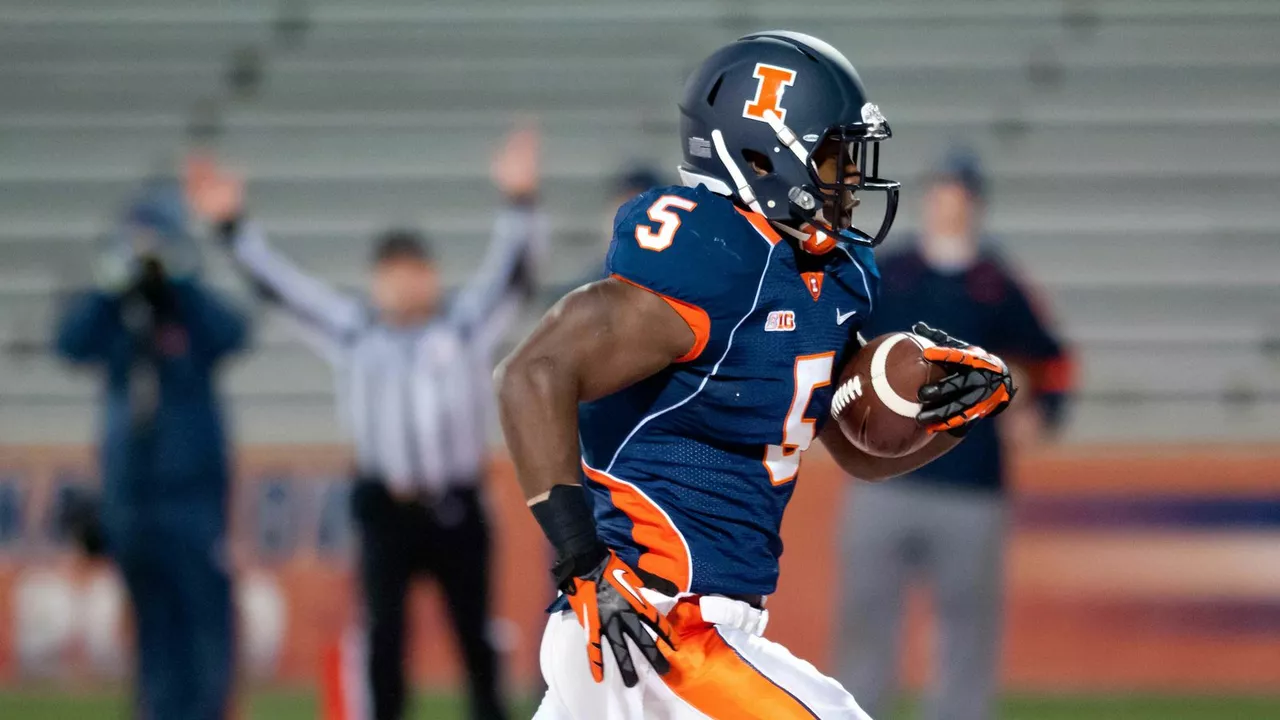
Team Colors – Why They Matter and How to Use Them
Ever wonder why you instantly recognize a team by the red jersey or the blue logo? That’s the power of team colors. They do more than look good; they create identity, stir emotion, and help fans feel connected. In this guide we’ll break down what makes a good color choice, how teams pick their palettes, and practical ways you can use those colors for branding, merch, or just showing support.
Choosing the Right Colors for Your Team
First off, think about what you want the colors to say. Red often means passion, aggression, and energy – perfect for a team that wants to intimidate opponents. Blue feels calm, trustworthy, and reliable, which can signal teamwork and consistency. Green is linked to growth and stamina, while black brings a sleek, powerful vibe.
Next, look at your local rivals. You don’t want to end up with the same shades as the team across the street – it confuses fans and dilutes brand power. A quick scan of other teams in your league can help you pick a hue that stands out.
Keep the number of colors low. Most successful teams stick to two main colors and one accent. Too many shades make the logo busy and harder to reproduce on uniforms, caps, or social media icons.
Don’t ignore psychology. Studies show that bright colors attract attention faster, while muted tones project stability. If you’re launching a new franchise, combine a bold primary color with a neutral secondary one to grab eyes but stay versatile.
Finally, test the palette. Print a mock‑up of a jersey, a hat, and a website banner. Make sure the colors look good side by side in both digital and physical formats. If they clash, tweak the shades until they flow.
Putting Team Colors to Work
Once you’ve locked in your colors, use them consistently everywhere. The logo, the uniform, the stadium seats, the social media graphics – all should share the same palette. Consistency builds recognition, and fans start associating the colors with the team’s story.
Merchandise is a goldmine. T‑shirts, scarves, and even water bottles in the team colors become walking billboards. Offer a few variations: a classic solid‑color tee, a two‑tone design, and a subtle logo version for fans who like low‑key style.
Digital presence matters too. Use the primary color as the background or header on your website, and the accent color for call‑to‑action buttons. When you post game highlights on platforms like Instagram or TikTok, add a colored border that matches your team’s palette – it makes the content instantly recognizable in a crowded feed.
If you run community events, decorate the venue with the team colors. Banners, balloons, and even lighting can turn a small gathering into a full‑scale brand experience.
Remember to respect accessibility. Ensure there’s enough contrast between text and background so everyone can read it. A quick contrast checker can save you from future complaints.
In short, team colors are more than a design choice – they’re a communication tool. Pick colors that match your team’s personality, keep the palette simple, and apply it everywhere you can. When you do, fans will rally behind the colors, merch will sell faster, and your brand will stick in people’s minds long after the final whistle.
-
18 Jul


